Project Overview:
The Product:
The furry friends pet adoption app is for people anywhere in America searching for a pet to adopt. With the app one can pick a pet, see tips and suggestions, watch training videos and order the pet. One can order a pet from any part of the country and pick it up at an adoption center.
Project Duration:
Due to doing this in between school semesters, it has taken me from July 2022 - November 2023 to complete this project.
Project Overview
The problem:
Many future pet owners can’t easily find a suitable pet for them without having a thorough idea of the pet’s personality and tendencies.
Owners struggle to find tips and suggestions for their particular pet.
Owner’s struggle to find training resources.
User Research: Summary
I conducted research by asking family and friendswhat they wanted from a pet adoption service. I asked the following questions:
What questions do you think you would ask at the reception desk of a pet adoption center?
What factors do you have in mind if you were to search for a pet?
What needs of the pet would you like to be aware of?
What advice would you like about home life for the pet?
Some of the assumptions that I had was that I simply didn’t think of the fact that users may want to volunteer at a pet adoption center. I didn’t think about the health aspects of the pets.
User Research: Pain Points
The user has questions when adopting a pet. The site will need to acknowledge these questions and have direction as to how they can be answered.
What factors does a future pet owner have in mind? I need to include descriptions of the dog’s personalities below their photos.
What needs of the pet would the user like to be aware of? Create a “Tips and Suggestions” section where the future owner can be informed of the pets’ needs and how to take care of them.
The future owner may struggle to know what advice she needs for the home life of the pet. There will be a training section with videos to watch.
Problem Statement
Sally is a teacher and a mother of two sons who needs to know that she can leave her dog at home because she worries it will rip up the house.
Frustrations
She doesn’t know how to tell whether the dog is friendly.
Worries about leaving dog at home.
Scared that dog will rip up the house.
User Journey Map (Mobile: Tilt to view map)
My goal was to create a website where people can choose their desired breed and pick them up at a convenient location. I feel the website would be successful if the owner knew about the health and behavior of the pet.
Sitemap
I looked at many other site maps to see the hierarchy with their tabs and navigation. I realized that a pet adoption service is a high matter of trust. That is why I included many tabs under “About”. I made the “training” tabs very visible to answer one of the top questions of the user. Health needs are answered in the “Veterinary” section.
Paper Wireframes
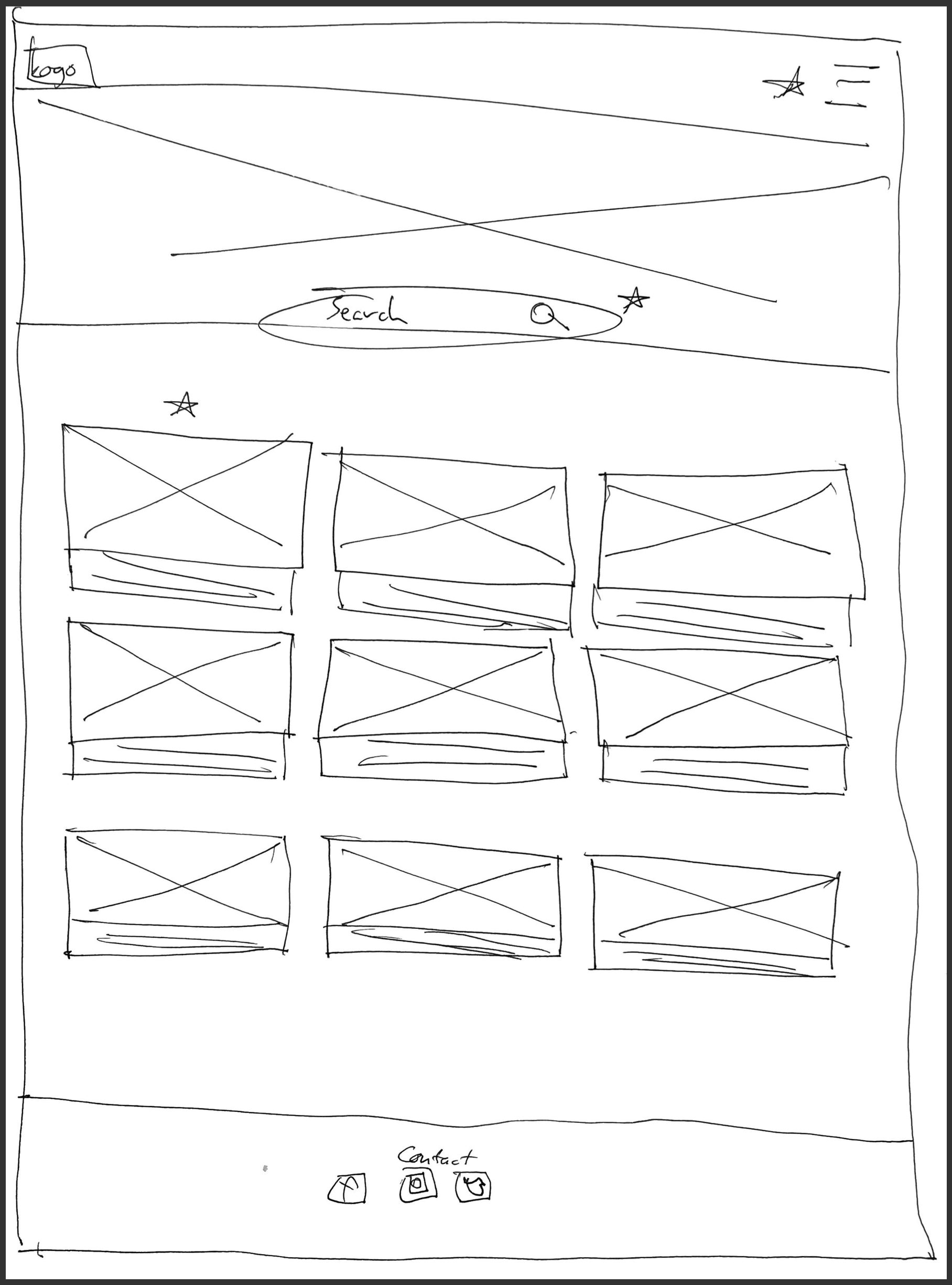
In the first wireframe, I decided to includes a gallery of pets at the bottom. The descriptions of the pets would be quite long. In the second wireframe, I decided to have larger images of the pets and shorter descriptions so that users can choose more quickly. I took out the gallery at the bottom since it cluttered the page too much.
Paper wireframes: screen size variations
I chose a single vertical column layout in both wireframes. The final home page layout ended up looking a lot like the first one. In the final design I chose to have a footer with social media icon links.
Digital Wireframes
My goal was to have the user first pick a category for his or her pet, choose the pet, decide if they want tips, suggestions and training tutorials, then go to the order process. I had to refine my wireframes by adding more content as peers said it was at first too simple.
Digital Wireframes: Screen size variations
The mobile version goes in the same sequence. There will be buttons which lead to more training videos and also pages solely dedicated to tips and suggestions. The goal is that the user will be confident and will envision the day-to-day life of having the pet.
Low-Fidelity Prototype
he home page had categories such as “home”, “about”, “dogs”, “cats” and “volunteer”. The intended route is to have the user click on the dogs and cats categories which will lead to more pets of the respective category. After the user makes his or her choice, they will be led to an order review page. The user can order the pet or choose to be more informed by learning tips, take suggestions, or learn training. From these pages, the user can confirm to adopt the pet.
I used feedback to fix the broken back buttons and I added more to the site to make the navigation more intuitive.
Usability Study Findings
It wasn’t clear that the logo icon was the route back to the home page. I had to reiterate it by labelling it “Home”.
One user said that it was a bit difficult to choose a pet within the categories. The pets need to have clearly distinct spaces in their categories so they can be easily distinguished.
The top navigation menu was confusing and a user struggled to return to where she wanted to go. It is conclusive that the back buttons weren’t prominent enough.
Mockups
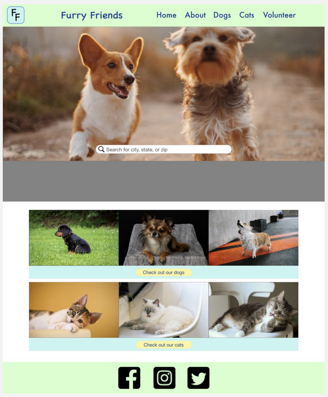
In the ”Before usability study” mockup, I wanted to create a bright, cheery layout with playful fonts. I thought it would be intuitive for the user to click on the pictures of the category to see more pictures. The color palette in the ”Before” mock-up was awful and one of my users said it looked like bad looking sites from the 90s. I changed the color palette and used different values of the same color blue. I rounded the corners of the elements and used a more modern font. I made the links to the organization’s social media sites more visible. The pictures act merely as a gallery to provoke interest and are non-interactive elements. The idea is to rather have the user click on ”See More” to choose a pet.
Before
After
Mockups
I took out the blaring color scheme with the bad fonts and replaced them with a softer, more gentle color scheme. I thought the page needed more breathability, so put more space between the images and text. I also included a back arrow to go back to the “order review” page, so the user can access the “tips and suggestions” page or place the order. I took the social media icons to the footer since, I wanted the site to take more priority the deeper the user went into it.
Before
After
Other pages in app
Mobile Frames
High-Fidelity Prototype
The user starts on the home screen and sees the categories of pets. The ”See More” buttons indicate that the user can see more pets. In frame 2, the user can pick a pet. In frame 3, there is an ”Order Review” and the user can choose to be further informed by clicking on ”Tips and Suggestions” or by clicking on ”Dog Training”. The user can choose either option and be led to those patients for further knowledge on the user’s future pet. The user can go back to the “Order Review” page and order the pet with the dark blue button at the bottom of the page. I was encouraged to design a mobile prototype which I plan to do. I want to create a tablet prototype as well I also received feedback that it was professional.
Accessibility Considerations
Although I used a monochromatic color pallet. The values were well distinguished making good contrast between buttons that had different priorities.
I put the logo on every page with a “Home” label below it clearly indicating a button that led back to the home page. The social media icons were large and noticeable.
The body text was well spaced and the text against a dark background was bold and medium, the text being white. This provided for great contrast and clarity.
Takeaways
Impact:
One of my peers said my work was very professional and modern, which gives me the desire to look up the latest design trends to keep up. Another peer said I should do a complete mobile layout, which indicates he and possible other people would want to see what the complete app would look like on other types of devices.
What I learned:
I learned so many great things about design cncepts such as proximity, common region and similarity. I learned how to make icons and color schemes clear to those with disabilities. From studying personas, I also learned that everyone has unique circumstances which influences the navigation and content of the website.
Next Steps
I would like to build more context of the Furry Friends organization by designing pages for it’s ”About” category. I want to design pages that drive people to get involved the the great cause of pet adoption. This section will be interactive since users will be able to comment on blogs and have conversations.
I want to focus on the health aspect by creating a portal for pet owners to be connected with veterinarians. There will be a search bar with parameters to find them. There will also be a way to choose the veterinarian and set a time to see him or her.
I would create mockups for a complete mobile website and app. I would also do mockups for a tablet website and app. Both of these device types have different layout styles and ways of using iconography and I’m up for the challenge.


