Problem:
People are working, studying, and have jam-packed schedules. They don’t have time to prepare a meal
The Goal:
Design an app that allows users to easily order a sandwich meal combination that is healthy and gives long sustaining energy.
My Role:
UX Designer for Henry’s Sandwiches designing an app from beginning to hand-off.
Responsibilities:
To conduct interviews, do digital wireframes, create low and high-fidelity prototypes, conduct usability studies, account for demands of accessibility, and iterate on designs after tests.
Pain Points
Time:
Working adults and students have too much of a jam-packed schedule to prepare their own meals.
Accessibility:
Food ordering platforms do not have enough accommodations that are compatible with screen readers or switch devices.
Information Architecture:
The typographic hierarchy is of low quality.
Icons:
The icons are non intuitive and users don’t know how to navigate in the apps.
Problem Statement:
Emily is a history teacher who needs a delicious sandwich that can be eaten during study breaks because she needs energy to get through her lesson preparation.
Frustrations:
The menu changes often.
The wait time is too long and the times keep changing. I feel like my meal keeps getting delayed over and over again.
Emily’s User Journey Map
(Tilt to view in Mobile)
Paper Wireframes
I want the user to open the home page and see that he can access multiple menus, that he can order and that he can visit his own user profile.
There are descriptions of all of the sandwiches. There are the reviews of the restaurant on the side.
There is a map to the shop.
Digital Wireframes
The goal with the homepage is that the user is able to access a hamburger menu (name of the three line icon, not actual burgers) to see extra options. The user is to be informed about the background of the restaurant and to have a good idea of the sandwiches they are ordering.
Low-fidelity Prototype
The low-fidelity prototype showing the process of ordering a sandwich and sides with the option of having group orders. This prototype can be used in a usability study with users.
Usability Study: Findings
I conducted two usability studies. In the first study, I transferred wireframes to mockups. The second study used a high-fidelity prototype and helped me know what aspects of the mockups needed touching up.
Round 1 findings:
Customizable options should be included.
Users should be added for orders.
Users should have an easy way of getting to the home page after an order.
Round 2 findings:
The order review display and option on the “sides” and “drinks” pages is unnecessary and should be taken off.
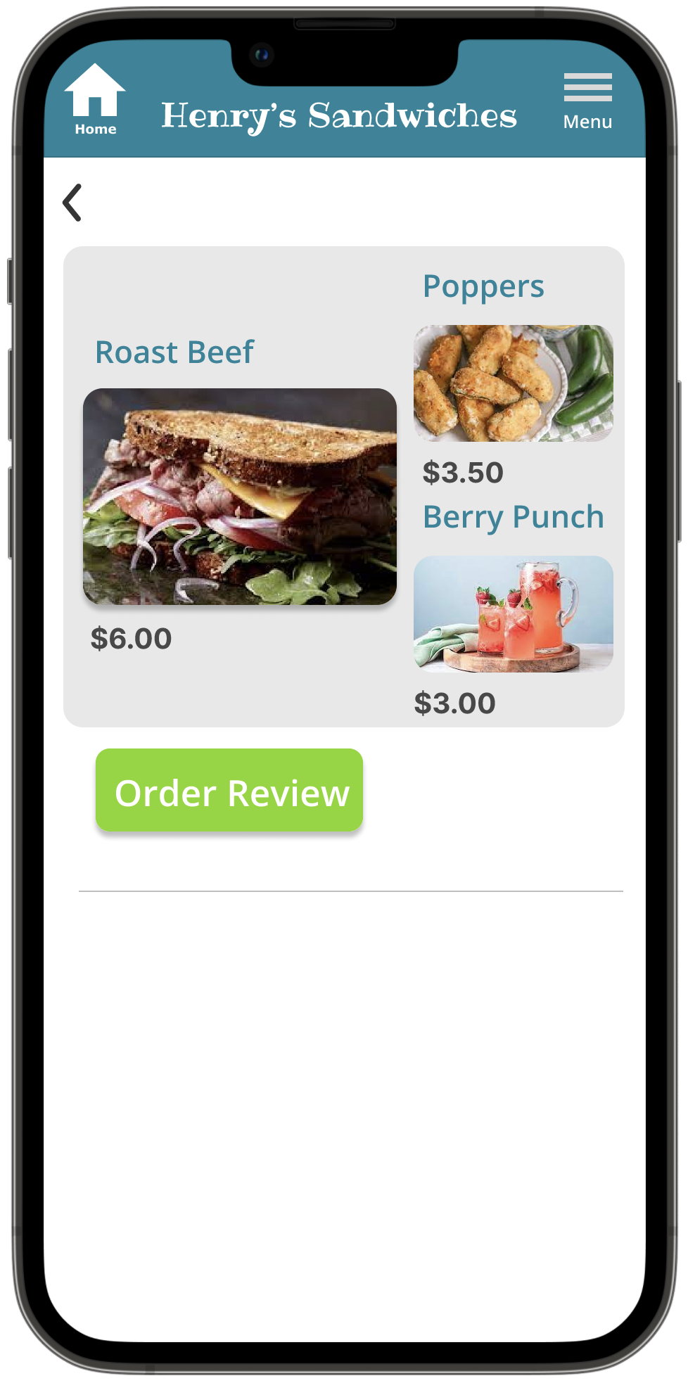
Prices need to be added to the menu.
The hamburger menu icon needs to be changed so it’s recognizable as a menu.
Mockups
One.of the participants in the study was confused by the reviews tab at the bottom since there are “order reviews” options in the app to see your order. I made the tab into a functional button called “Restaurant Reviews” to differentiate. It has a pop up overlay with reviews of the restaurant.
Mockups
One participant recommended that I set prices for the items. This would make the choices a lot more discernible. Once a cost is set, the dynamic changes.
Key Mockups
High Fidelity Prototype
Accessibility Considerations
I provided high contrast in the elements so the user can easily differentiate between the function and purpose of the buttons.
I labelled the icons so they can be easily identifiable for people who don’t know what the shapes represent.
I used dark text against light colored backgrounds and light text against dark backgrounds to create contrast so text is easily readable.
Takeaways
Impact:
This app is a convenient enhancement to the busy lives of many who need essential sustenance to assist with their schedules.
What I learned:
I learned that by analyzing human circumstances and needs, it is known that I can cater apps for humanity and for all of its struggles. Everyone is unique and apps should be adaptable for everyone’s lifestyle.
Next steps
Conduct more interviews to see if new needs or circumstances have arisen which may alter the app and it’s new experience.
To see if I can create another problem statement to target a new issue.
To keep up with branding by inquiring whether stakeholders will want styles and color schemes to change.


