Collaborative Design
-
![World Health Organization 1]()
World Health Organization 1
-
![World Health Organization 2]()
World Health Organization 2
-
![World Health Organization 3]()
World Health Organization 3
-
![Typography Poster]()
Typography Poster
-
![Shapes Composition]()
Shapes Composition
-
![1984 Collage Book Cover]()
1984 Collage Book Cover
-
![1984 Flat Illustration Cover]()
1984 Flat Illustration Cover
-
![1984 Drawn Book Cover]()
1984 Drawn Book Cover
-
![Creative Strategy 1]()
Creative Strategy 1
-
![Creative Strategy 2]()
Creative Strategy 2
-
![Creative Strategy 3]()
Creative Strategy 3
-
![Bookshop Logo]()
Bookshop Logo
-
![Dave's Mill Bakery Logo 1]()
Dave's Mill Bakery Logo 1
-
![Dave's Mill Bakery Logo 2]()
Dave's Mill Bakery Logo 2


This site has my graphic design work and UX designs that I have created throughout my online courses and classes in the past. I have spent time learning the Adobe products and Figma to create posters, book covers, logos, illustrations, photographic compositions, app designs and more. I am passionate about what I do and I work with others to create inspiring designs that move people to action.
I specialize in web design, graphic design, UX design, social media marketing, and search engine optimization (SEO). Using a content management system, I can tailor your website and branding for your business needs. Through my social media marketing implementation, your business will have a high conversion rate and great recognition.
World Health Organization posters
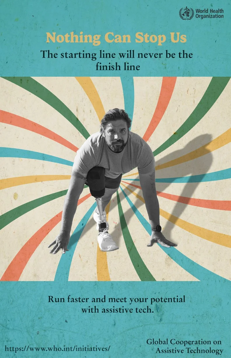
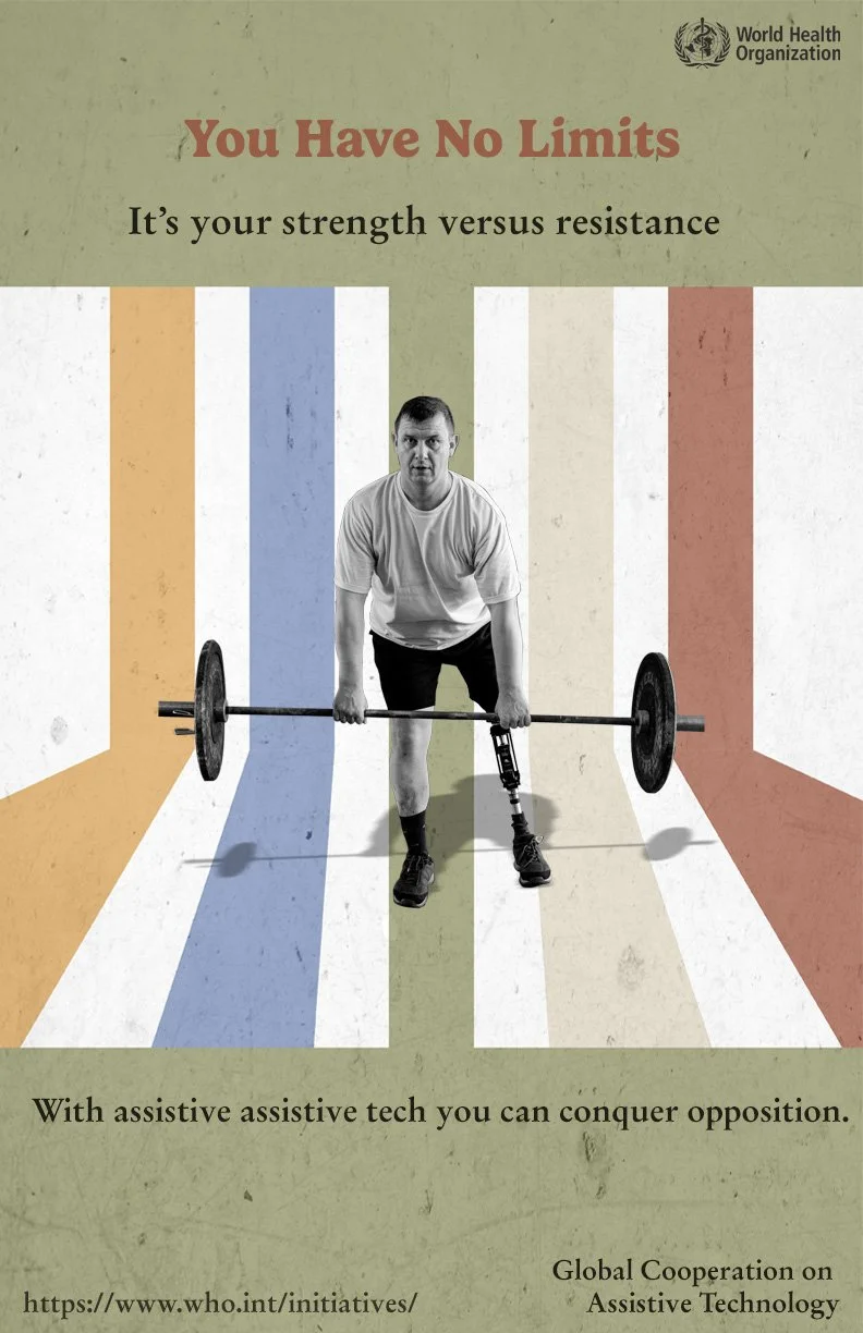
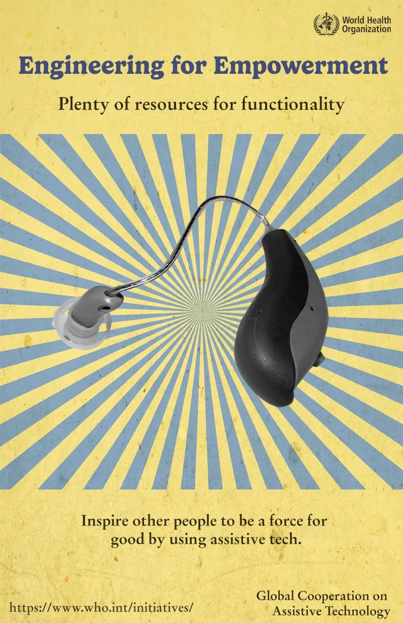
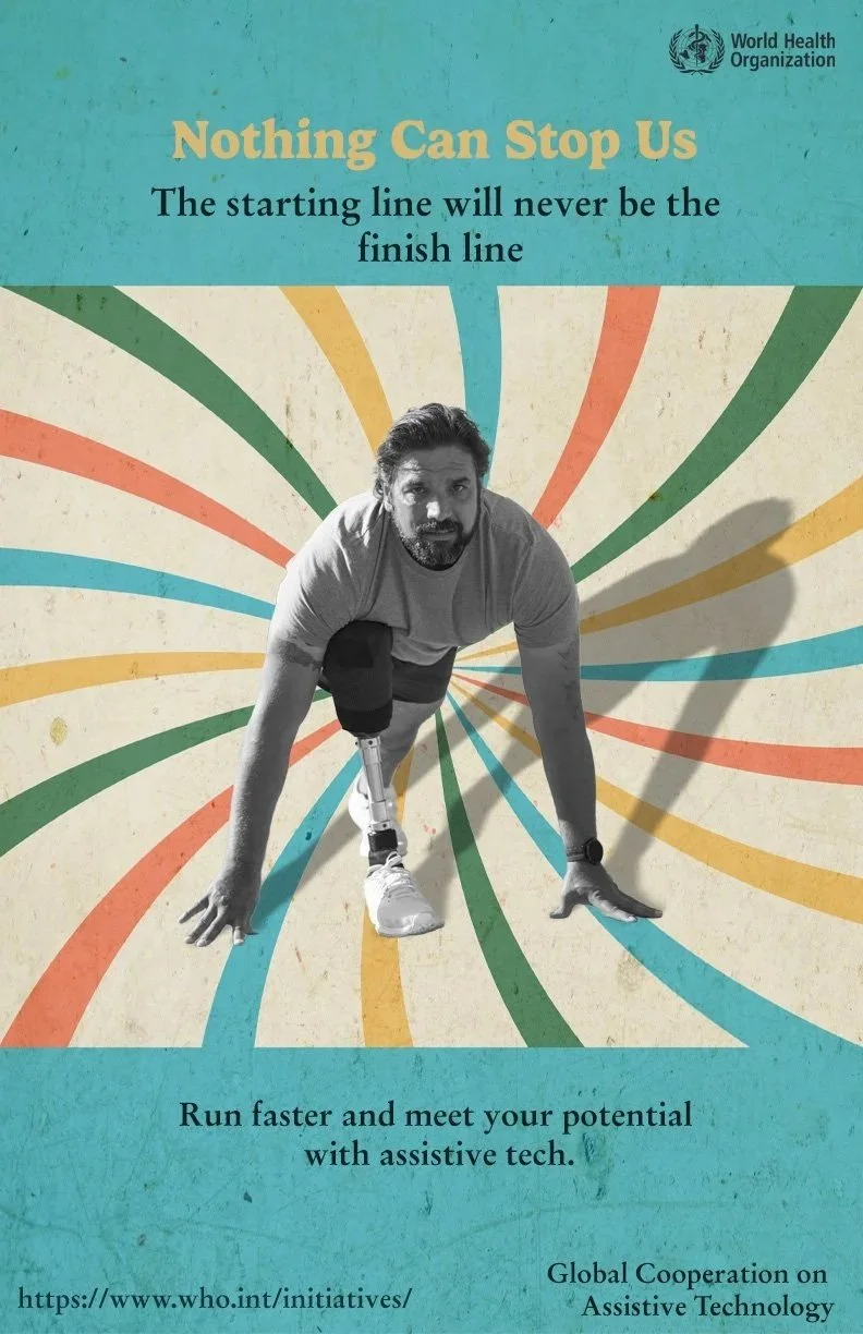
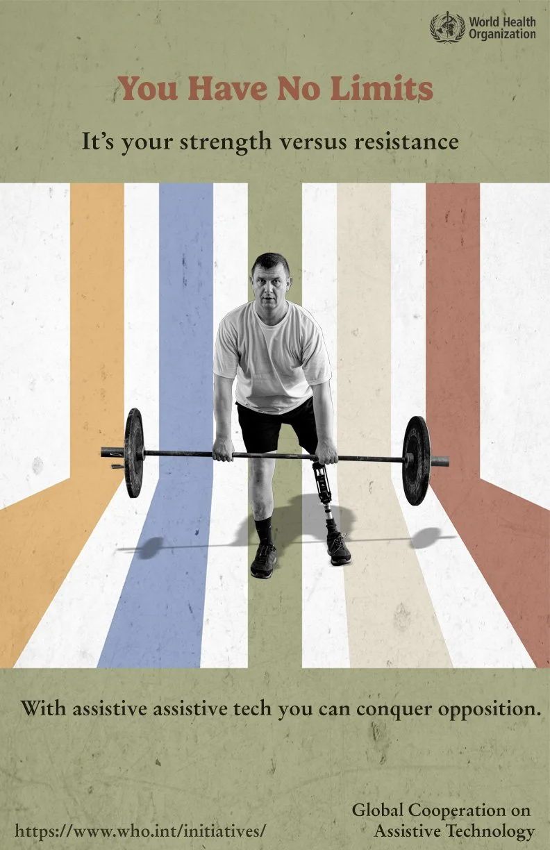
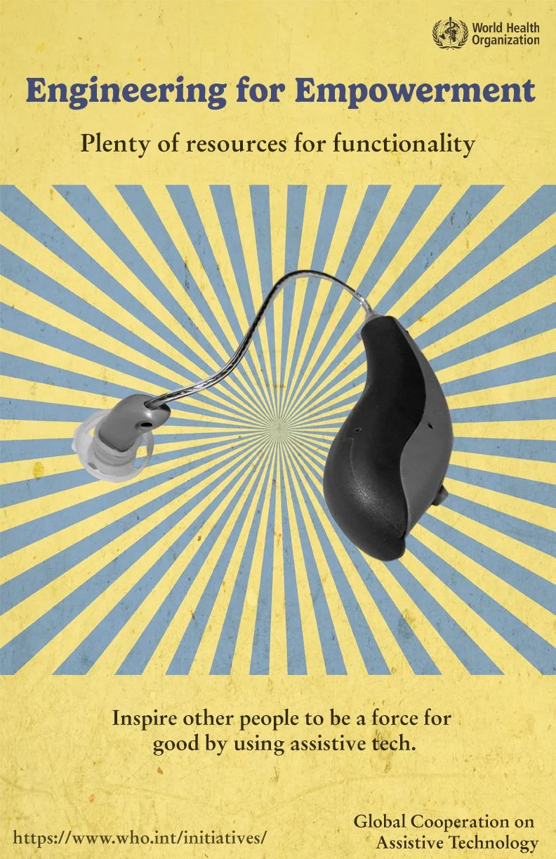
I created 3 posters for a public service announcement on an important issue that affects people how have disabilities. I was tasked with creating strong memorable depictions to bring about awareness and spur action. The posters display images of people using assistive technology to empower them and meet their goals. The slogans are inspirational and it reminds people with accessibility needs that they can achieve what they put their minds to when they utilize their resources.
I had an enjoyable time creating vintage themes by creating colorful backdrops with a mostly transparent texture over them. I then placed greyscale images of athletes and a hearing aid over them to complement the vintage aesthetic.
Shapes Album Cover
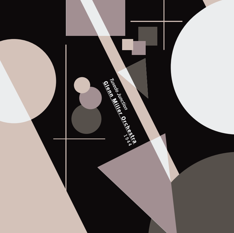
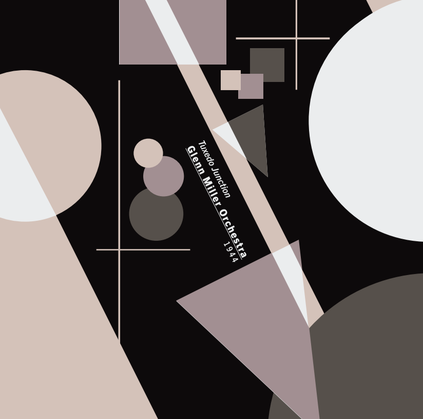
For this project, I created an vintage album cover done for the band, Glenn Miller Orchestra. The song was tuxedo junction and I chose a color pallet that gave the mood of a fancy dinner party. I only use geometric shapes for this to prove what I could do with constraints. This was at a time when I was learning the basic principles of graphic design, learning about things like scale, depth, unity, balance, emphasis and so on. The first drafts were too symmetrical, so I had to revise that with different placement.
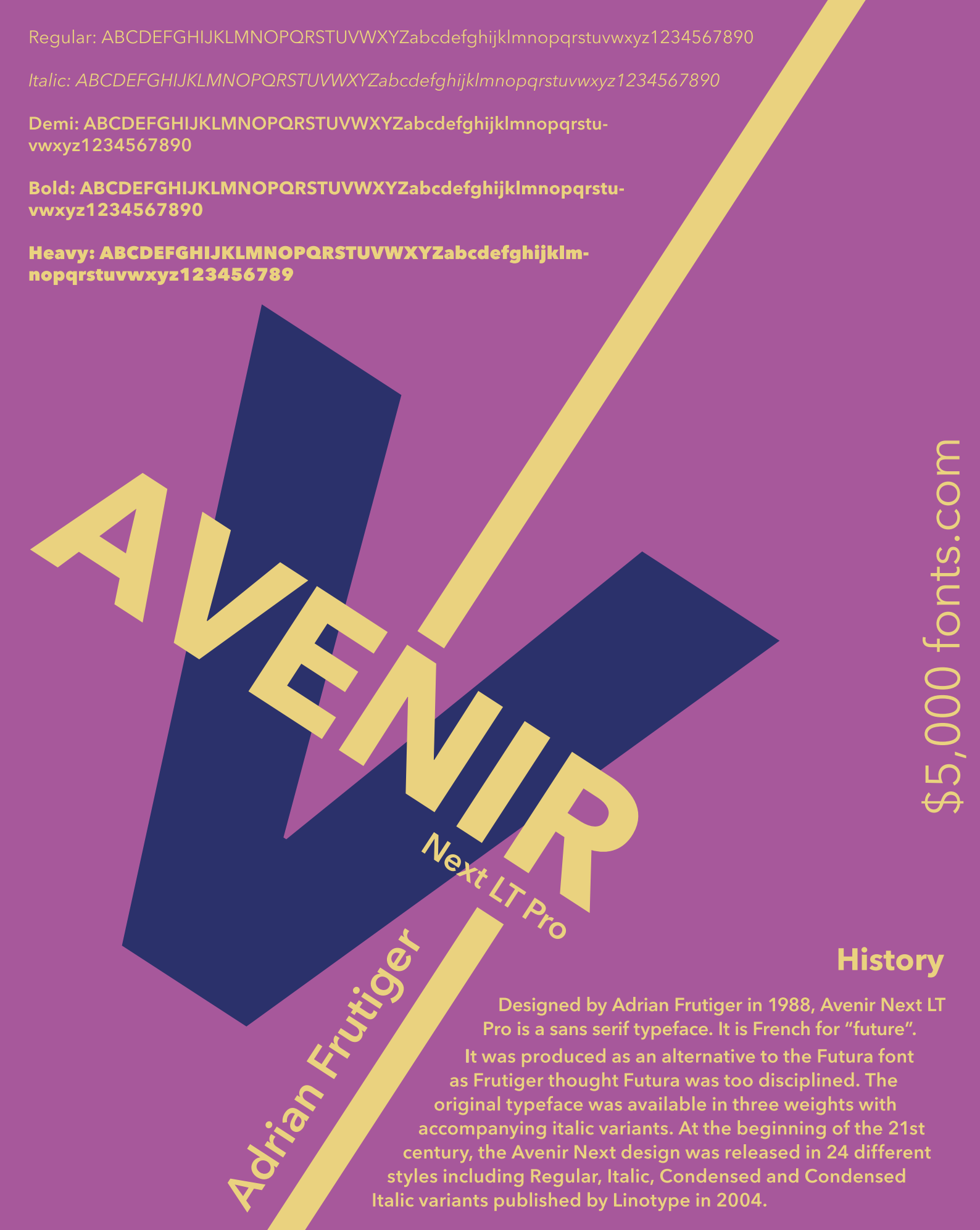
TYPPOGRAPHY POSTER

This is a typography illustrating the many ways that the typeface, Avenir Next LT Pro can be used. I was tasked to create a poster where all of the font weights were included along with the history of the typeface. I had to choose three colors that worked well together for which I researched which colors would be compatible. Although the colors are complimentary, the combination is still soft on the eyes. The deep blue is also harmonious with the purple. I implemented a diagonal direction for interest and dynamism.
1984 BOOK COVERS
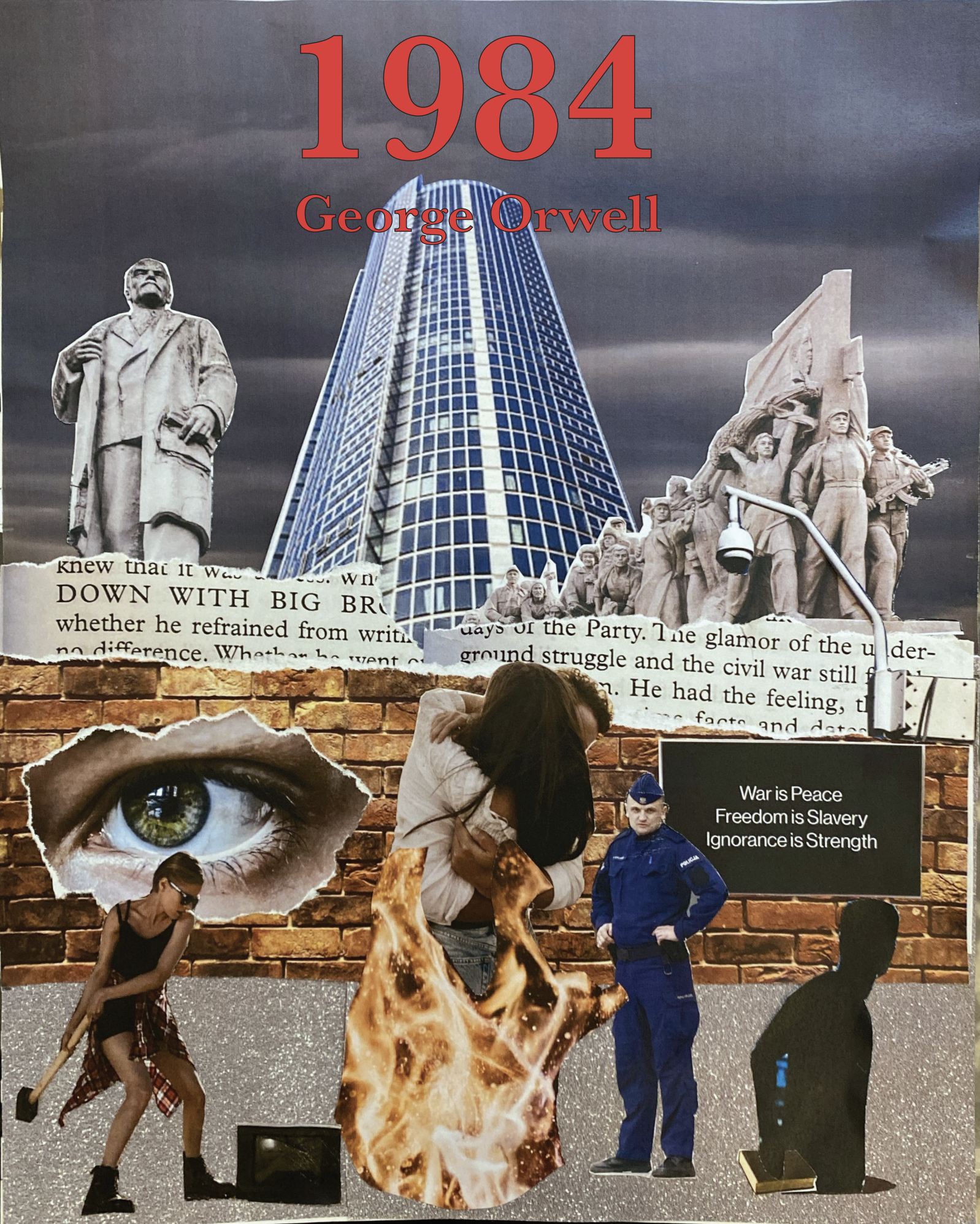
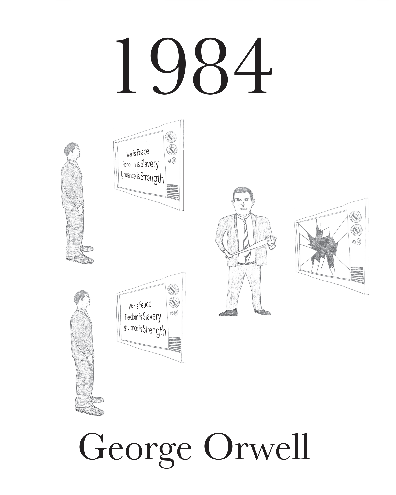
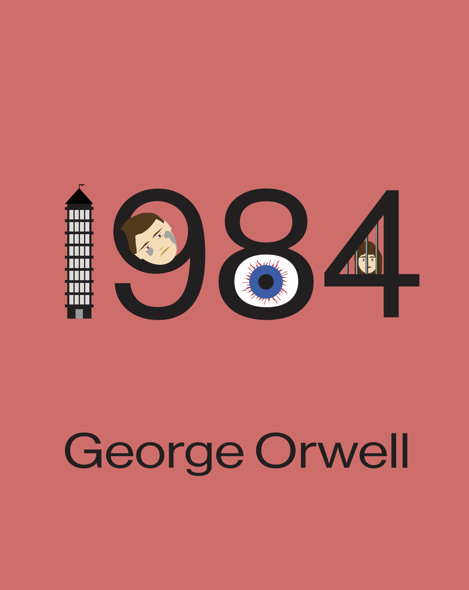
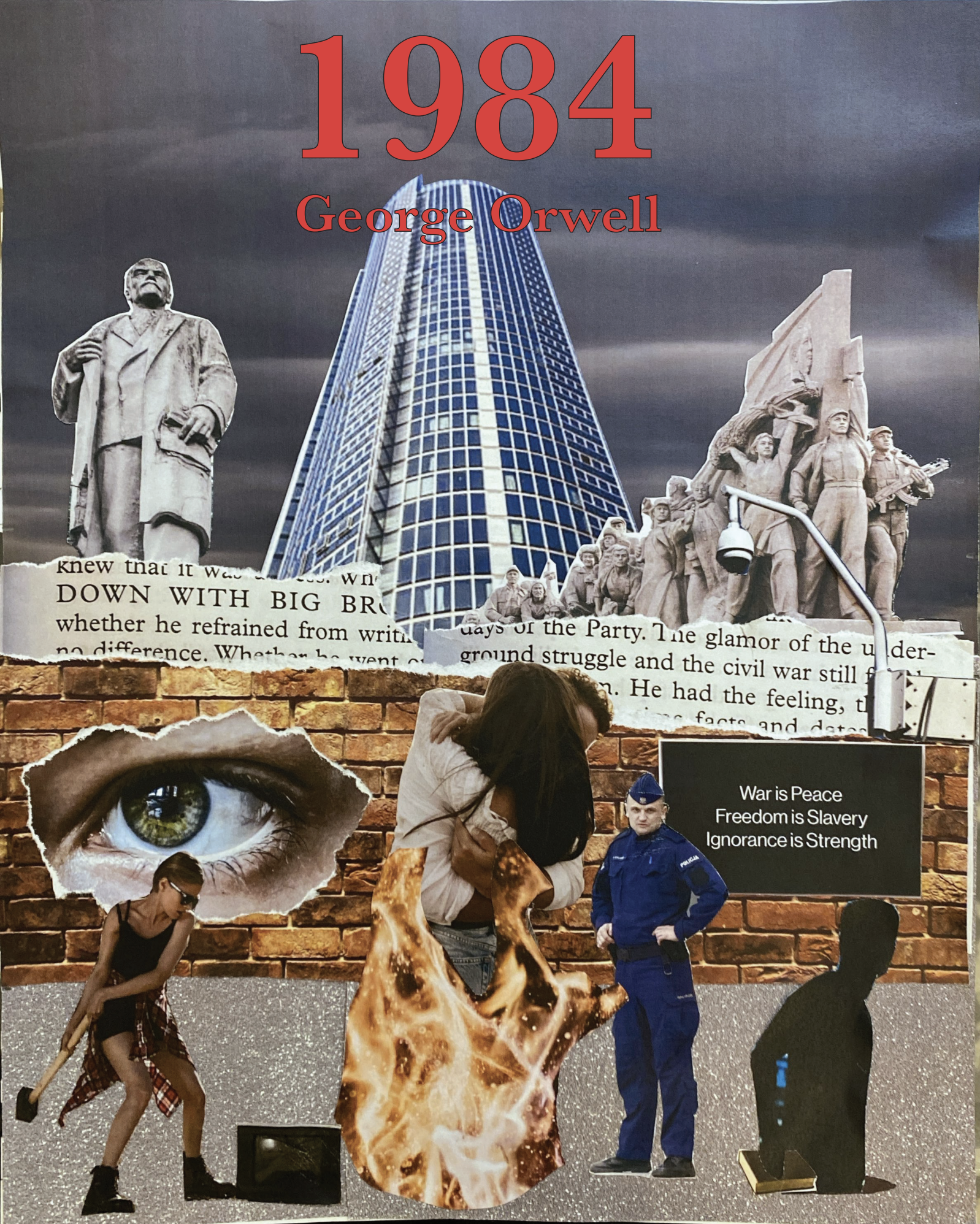
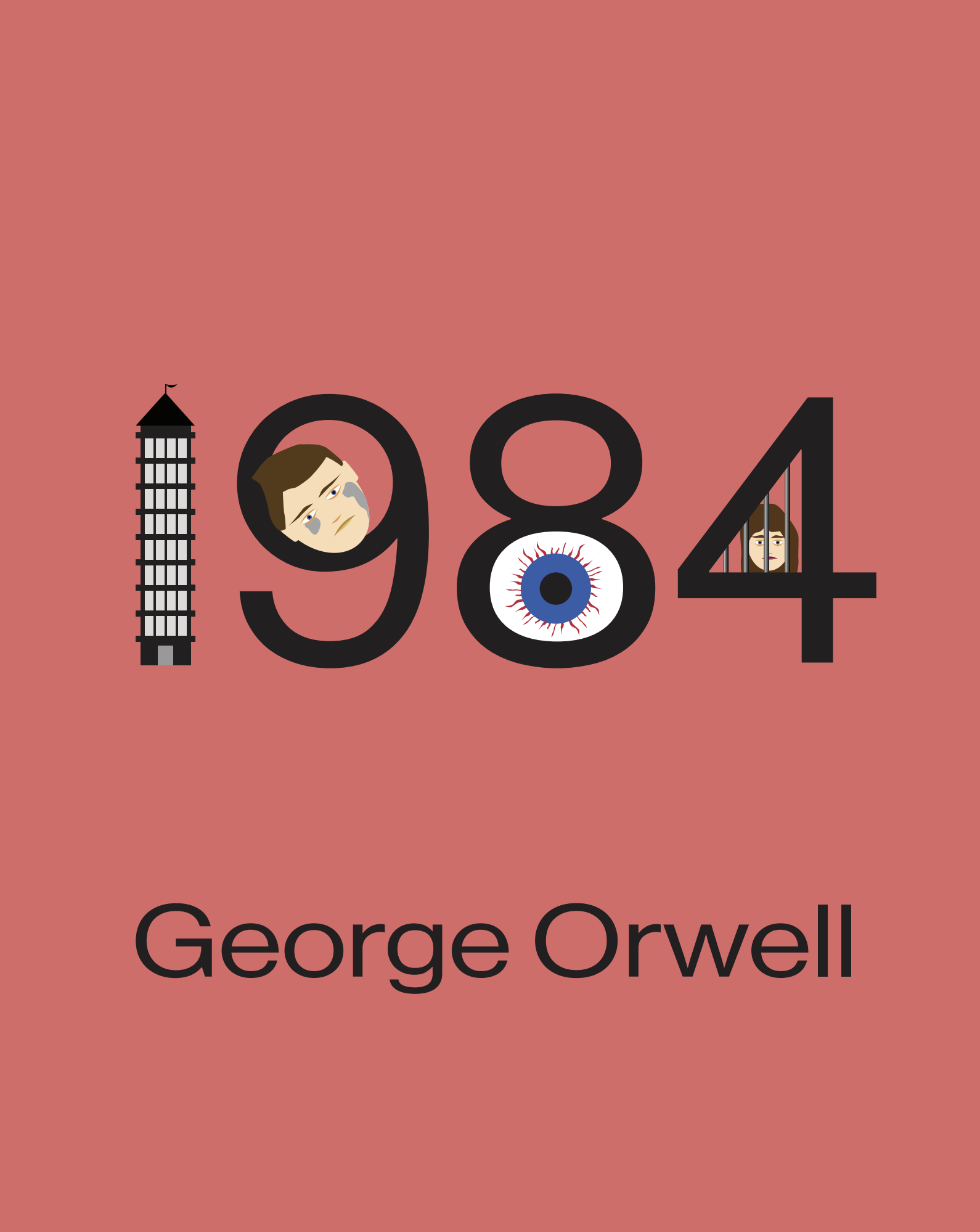
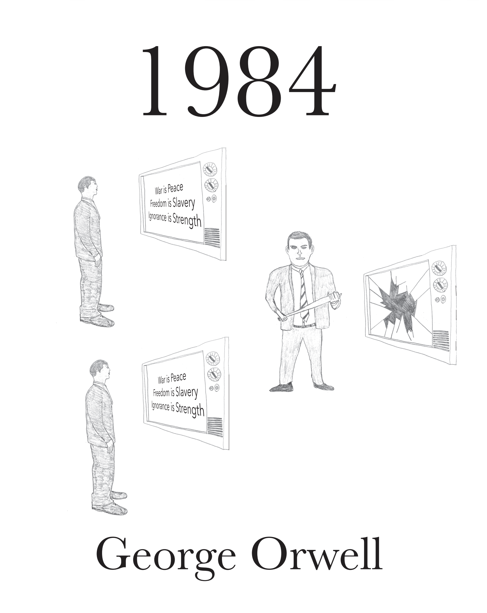
I found a classic novel which really spoke to me and I designed three covers to project the author’s symbols, ideas, and background of the book, 1984. I focused on the themes of the book such as totalitarianism, censorship, surveillance, and monitoring.
The first cover is a collage and I got to choose this out of other mediums such as knitting, crocheting, painting, drawing, and more. I pasted a broken city against a dark sky with dominant symbols of subjugation.
The second cover was a drawing of the main character bashing out one of the TVs that instructor the citizens standing by some other citizens being mindlessly brainwashed.
The third one was done in illustrator. I love flat illustration and I used this method to portray a downtrodden Winston along with his imprisoned girlfriend. The eye of Big Brother stares fanatically and the Ministry of Truth looms replacing the one. The typeface is Neue Haas Grotesk Display Pro.
3 Creative Strategies
—Jaya Dixon
Shift in Scale

Material Change

Metaphor or Simile
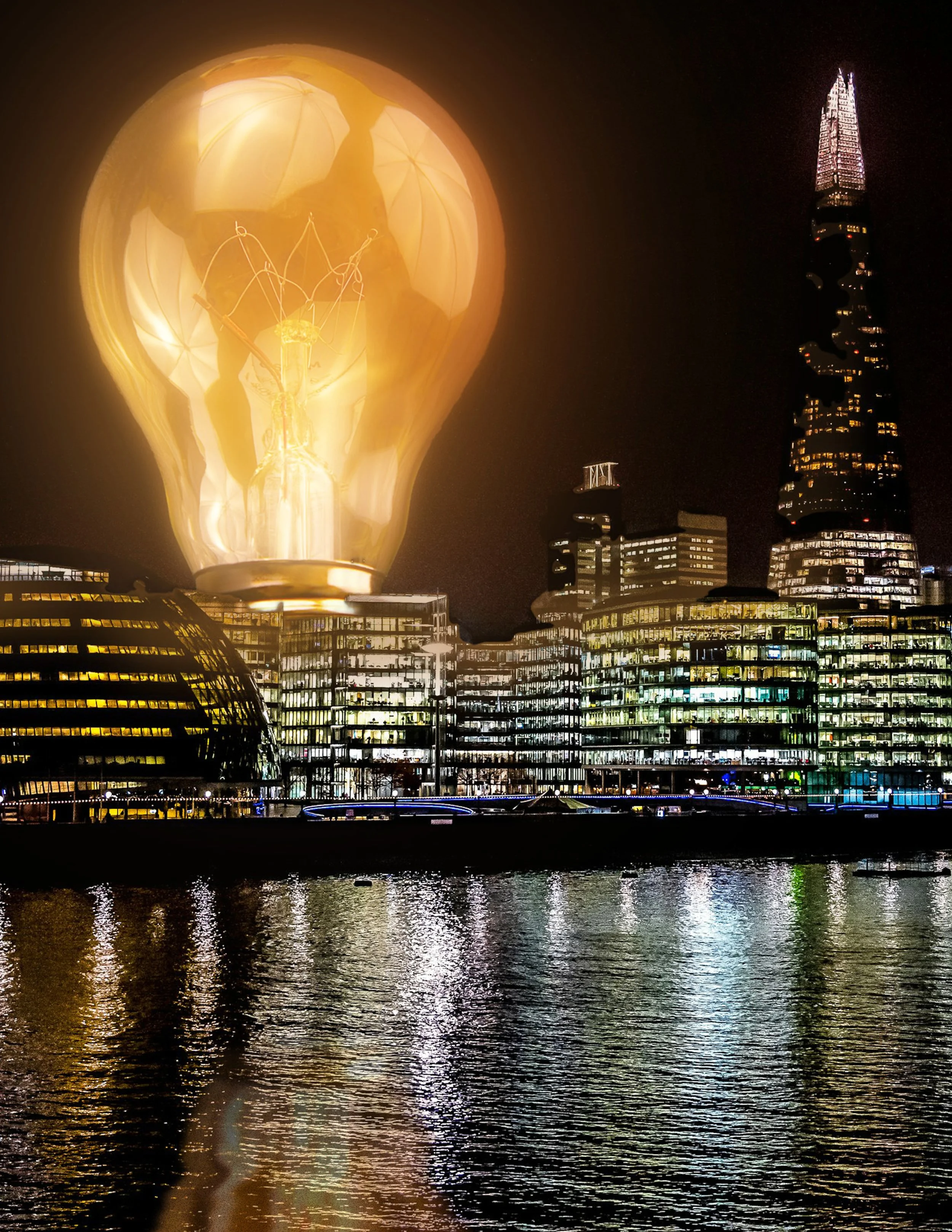
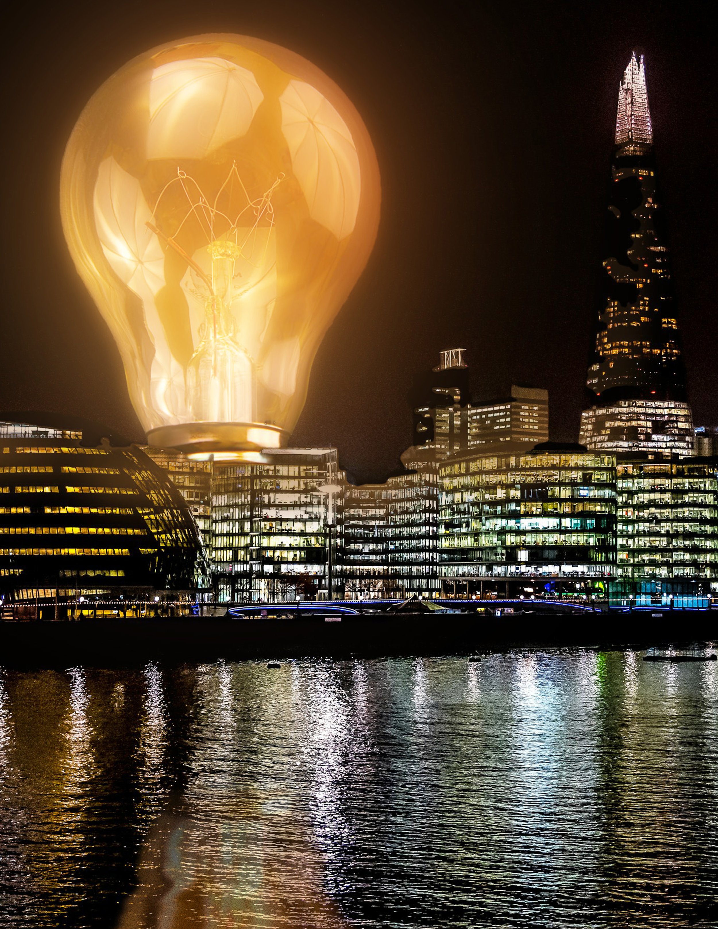
I selected visual concepts to represent an idea using a single object such as a ruler, stapler, string, hammer, screwdriver, etc. I chose something which is easy and common to identify; a lightbulb.
With photoshop I used a lightbulb to employ the following creative strategies:
Shift in scale: To show an object at an unrealistic size.
Material change: To change the texture or physical state of an object to something which surprises.
Metaphor or Simile: To make the object representative of something else.
It was fun to play around with hue saturation adustment layers and create a reflection.
The Wise Owl Bookstore Logo
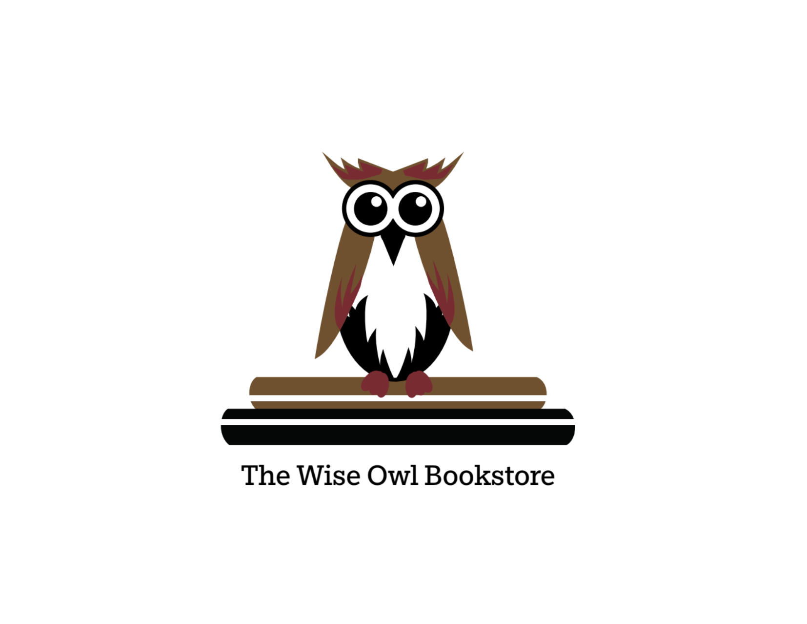
I created a logo with a symbol - the owl. I illustrated an owl and used it since it speaks of wisdom and oversight. There is also calmness in the owl, but his eyes make the logo a bit quirky too adding fun. People would like to be at peace when reading and searching for book. I chose a slighted muted color scheme. I decided on using the typeface, Egyptian Slate Std.
Dave’s Mill Bakery (done with the book, Graphic Design for Everyone)
Business Stationary
Business Card Front
Business Card Back
Thank-you Note
Letterhead
UX Projects
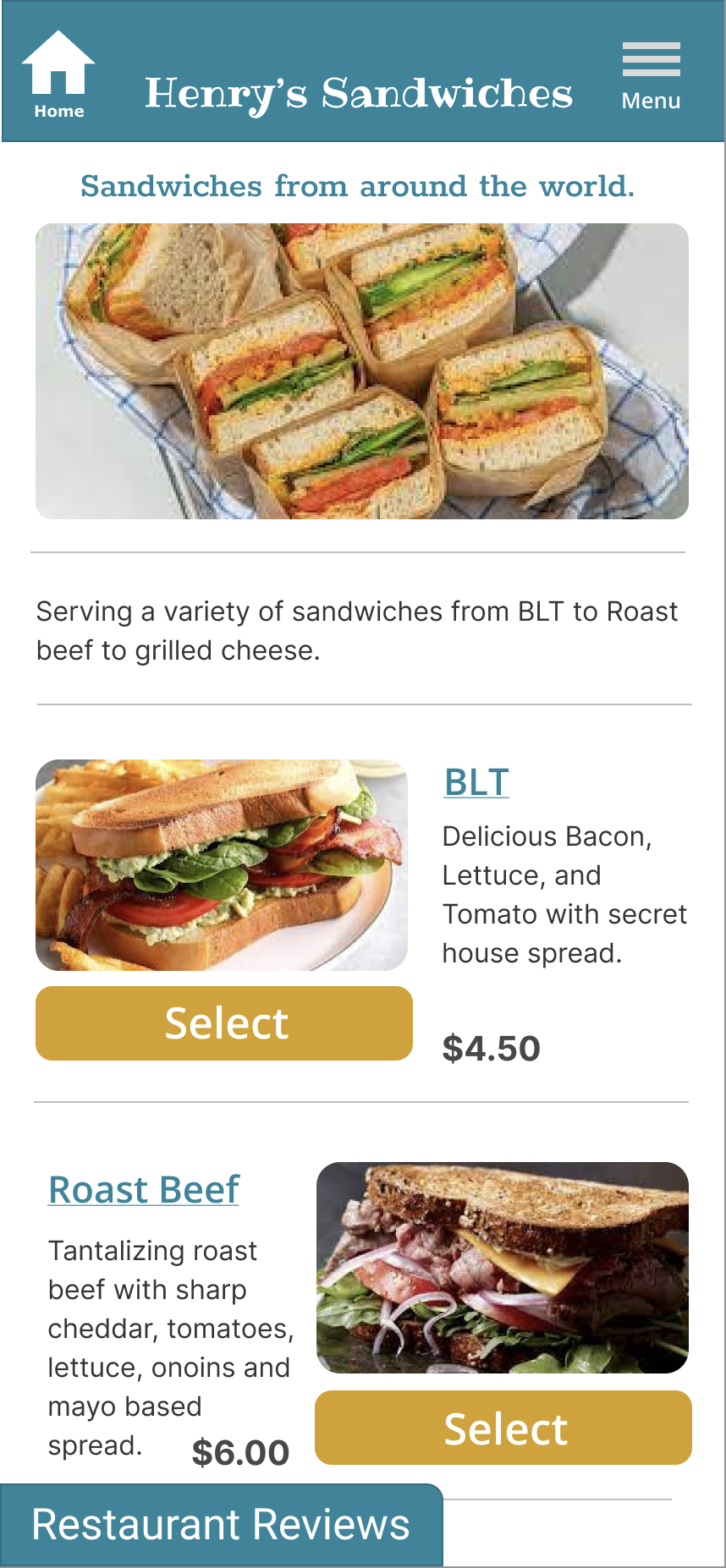
Henrys’ Sandwiches
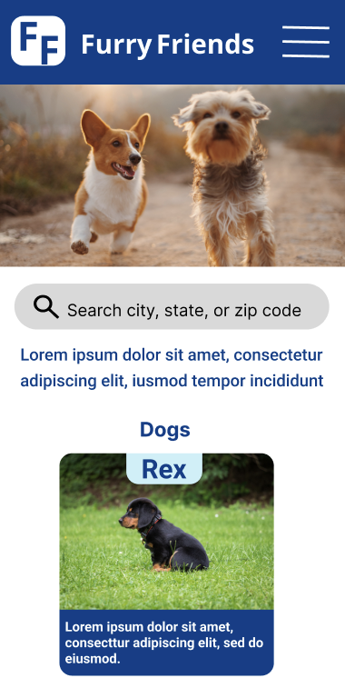
Furry Friends
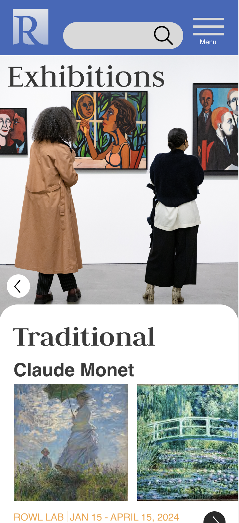
Rembrandt Art Museum